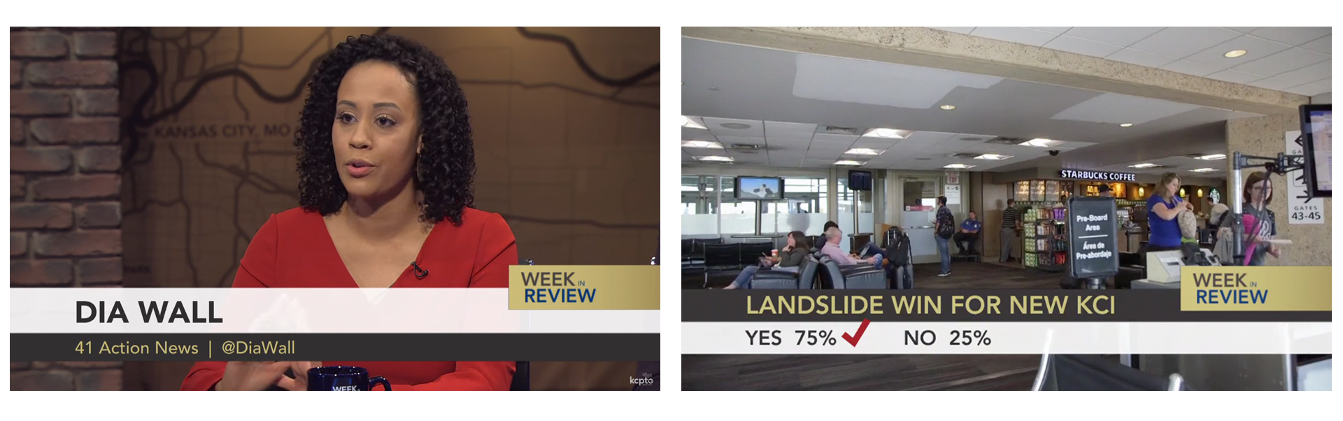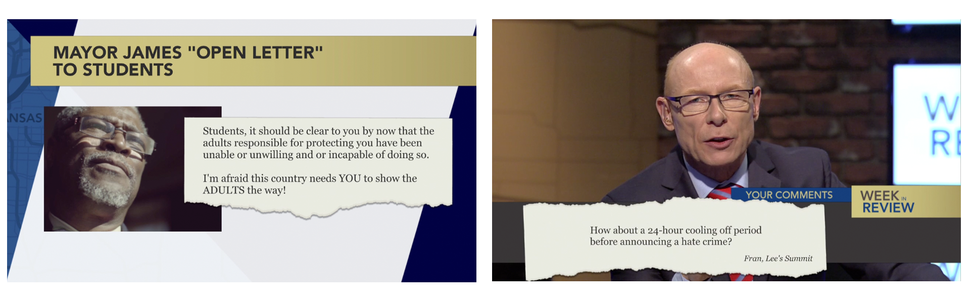
Week In Review is KCPT's weekly local public affairs reporter roundtable program. I worked with the show's Executive Producer, Producer, Directors, Studio Coordinator and others to create a cohesive new look for the show. The format of the show stayed the same and we decided to stay with blue as one of the key colors for continuity, but gave the show a more modern feel while making it more representative of our wider community. We looked to other public affairs programs for inspiration, and we identified different graphics that were necessary and worked in elements such as the "ripped from the headlines" look that the Executive Producer likes. Additionally, I gave the graphics package a spinoff for our the yearly Year In Review edition in December.
KCPT overhauled its visual identity in 2016 in order to reflect is evolution in the preceding years. We worked on the rebrand with the team in-house, and I created the logo and updated brand elements. Some of our challenges included incorporating the PBS logo into our logo, making the logo more usable on different backgrounds for both print and screen, creating options with and without a tagline and having brand options for more horizontal and square usage. I led interns and contractors in using new brand guidelines and elements to create items like stationary for the company. I also worked with outside vendors to have animated elements created for use on air and in video projects.
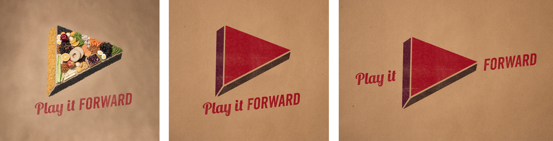
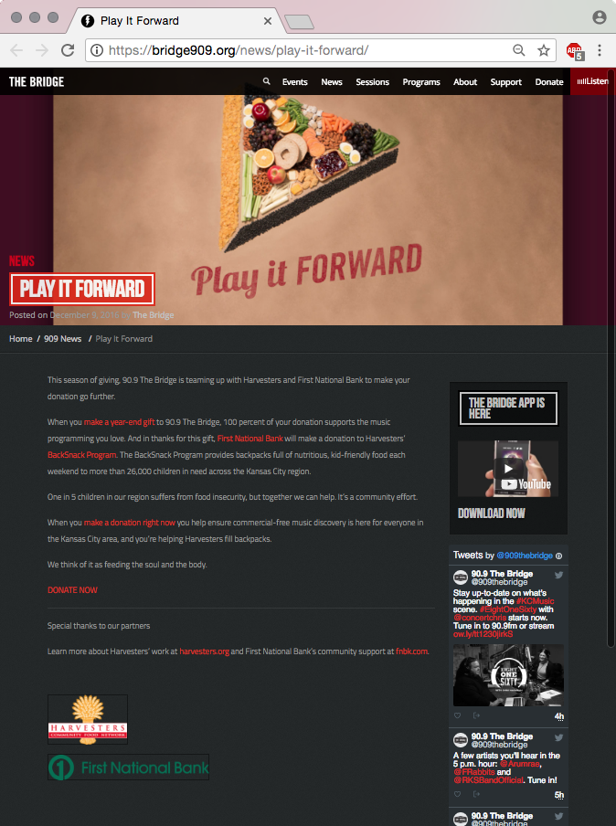
The Play it Forward campaign was created for a member drive for Kansas City's NPR Music station 90.9 The Bridge. This member drive included a partnership with our local Harvesters food bank, and for every donation made to the Bridge there was a matching donation to Harvesters. We wanted the artwork for this drive to highlight the partnership with another organization in the community while also fitting the radio station's brand.
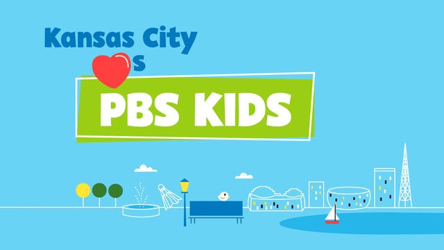
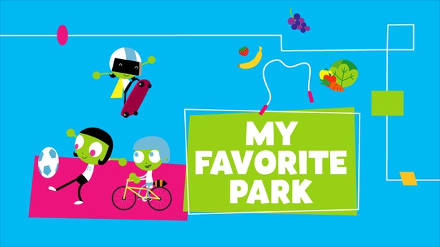
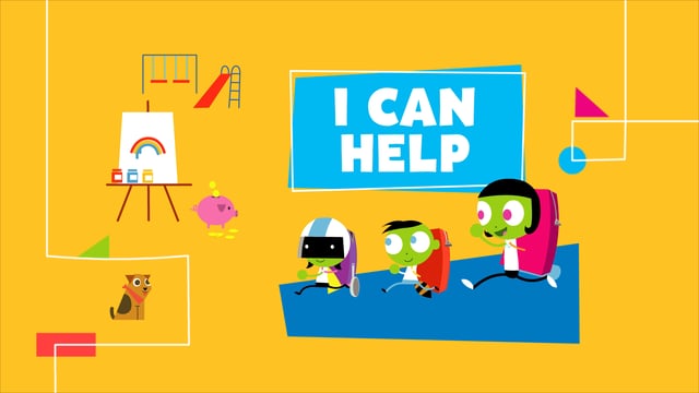
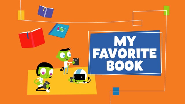
KCPT KIDS is Kansas City's local PBS KIDS brand. We created the logo for it to go along with KCPT's rebrand in 2016, and last year we launched a 24/7 PBS KIDS channel. Using the PBS KIDS brand package as a base, I combined and arranged their existing elements — such as characters, icons and color palette — while adding still and motion graphics that I created that conformed to their brand package. These graphics are used on air around local kids content during programming breaks and in print, web and social media promotions efforts for the 24/7 channel.
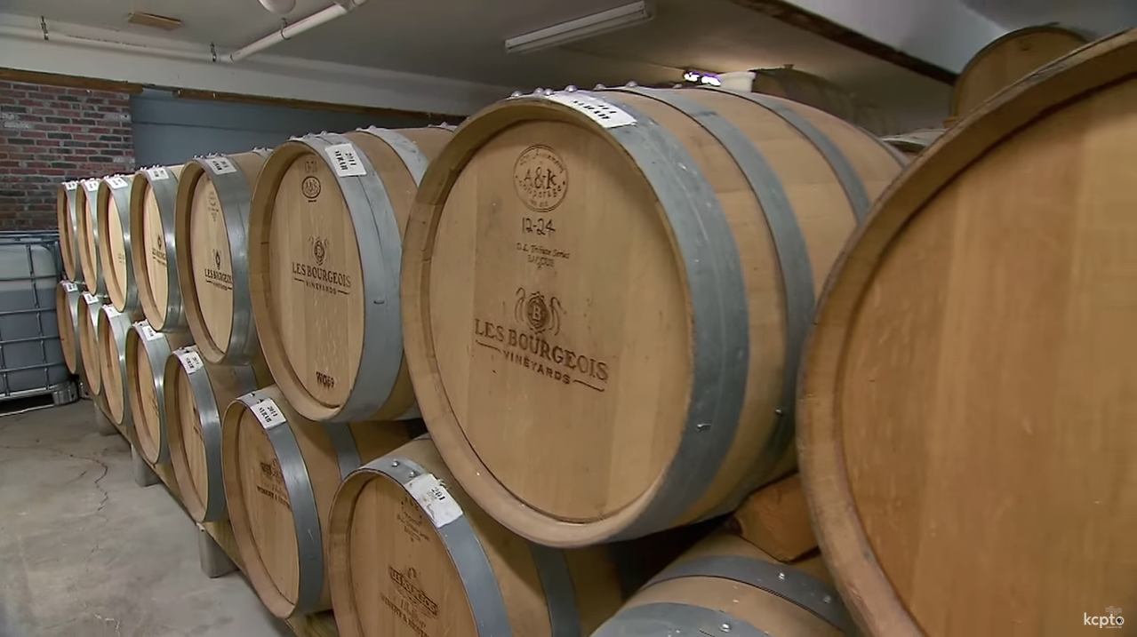
This series of video segments was about the science behind wine. American Master of Wine and Master Sommelier Doug Frost worked with a producer from KCPT and myself to tackle the subject in a light-hearted, slightly goofy and approachable fashion. The segment "Wine Is Mystery" won a 2017 Mid-America Regional Chapter EMMY® Award in the Informational/Instructional — Feature Segment category.
"Inspired by Kansas City. Made for you." is a member drive campaign for Kansas City's NPR music station, 90.9 The Bridge. We really wanted to bring in the city, so the design uses photographs of different locations throughout the city. In addition to the design for this campaign, the Membership Director for the Bridge and I went out and took the photographs and planned out what locations we would use.
Flatland, KCPT's digital magazine, features several stories that explain how some things, such as food products or inventions, that have local connections came to be. One set of stories that was featured was a music edition, explaining how four local bands got together. I worked with two writers and illustrated the bands' stories comic book-style.
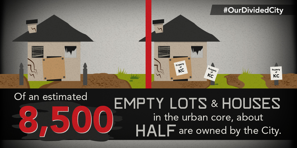
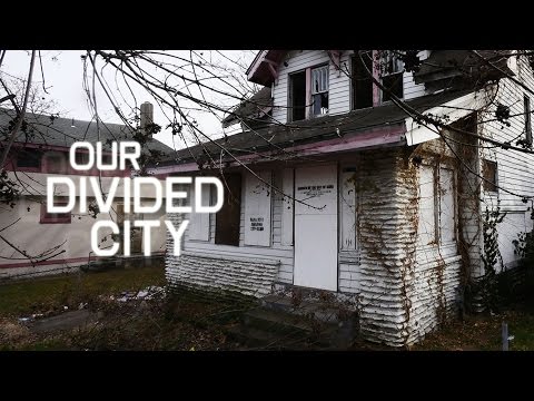
Our Divided City is a film by filmmaker Michael Price that explores Kansas City's East Side and examines if enough is being done to make the east side safe. My graphics contribution to the film included a number of maps that helped to illustrate crime hot spots, blight, and other concepts. I used my art direction to create promotional materials for the film as well as social media graphics that were used to engage the community during the broadcast. Our Divided City was nominated for a Mid-America Regional Chapter EMMY® Award in 2016.
This 18x24" poster was created and given to local business Smoke 'n' Fire as a thank-you after their BBQ & Blues event, which benefitted KCPT.
This campaign for Kansas City's NPR music station, 90.9 The Bridge, focused on music discovery. The Membership Director and I filled the campaign with different feelings that music can evoke and asked subjects to convey those feelings during a photoshoot. Subjects included members as well as local musicians. I used line work and color to highlight different feelings in the art.
This index card-sized brochure was created for KCPT's executive team to take out into the community and hand out to new contacts. It gives a quick glance at all three of the brands that are part of our company — KCPT - Kansas City PBS, NPR music radio station The Bridge and Flatland, KCPT's Digital Magazine. It won a gold Philly Award for excellence in marketing for nonprofits in the Informational Brochure category.
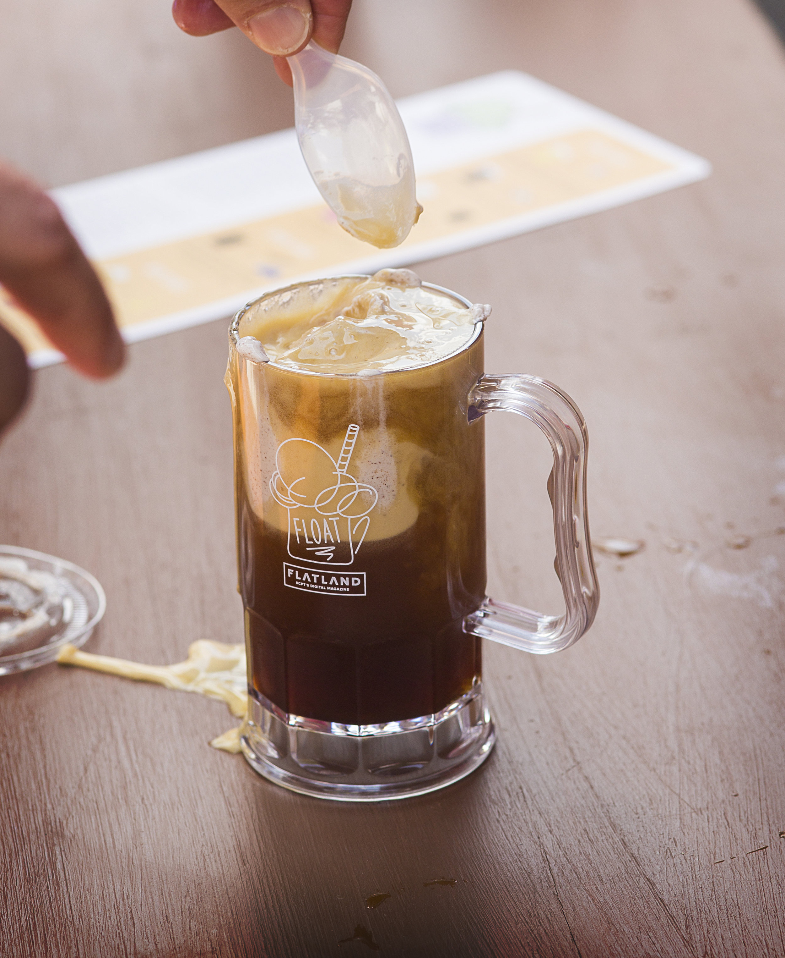
Float was an event that put a fun twist on the classic ice cream float. It was held by Flatland, KCPT's digital magazine, along with several partners and was meant to raise awareness of and drum up excitement for the Flatland brand. The event required its own logo and art direction, which were applied to event materials, advertising and swag. In addition to creating the direction and materials myself, I guided interns and worked with a Junior Graphic Designer as they used the art direction to create additional elements and materials.